How To Guide
How to make signs that work at 60 km/h (plus clear labels)

Think like a driver with two seconds to decide. Your sign has one job: say the thing, simply, from far away. Fewer words, bigger letters, strong contrast. That’s the whole brief.
BIG ROAD SIGN: KEEP IT SIMPLE
Start with the message. Pick the one thing you want people to know right now:
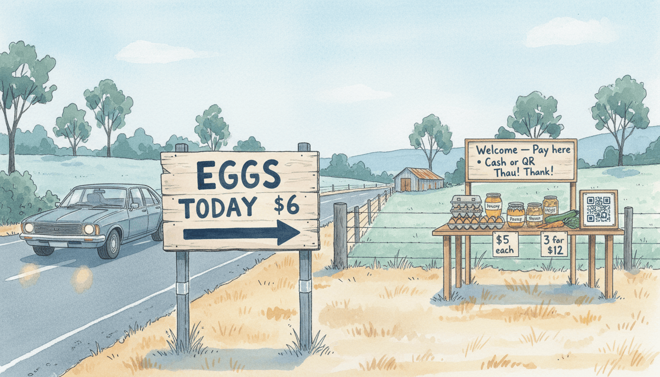
EGGS TODAY
NEW POTATOES
HONEY
SOURDOUGH SAT
Keep it to 1–3 words, plus a price if it helps. Save the friendly fluff for a smaller “hello” sign at the table. Big sign = product + maybe price. That’s it.
SIZE MATTERS (MORE THAN YOU THINK)
For 60 km/h traffic, aim for:
• Main letters: 120–150 mm tall (12–15 cm)
• Prices and short extras: 90–120 mm
Anything smaller is a guess from the driver’s seat. If you’re hand-painting, use a wide brush and thick strokes. Skinny lines just vanish at speed.
MAKING IT READABLE AT A GLANCE
You’re not designing a poster; you’re shouting clearly from the paddock.
• Dark text on a light background works best (black on white, navy on pale yellow).
• Avoid photos and patterned backgrounds – they just make noise.
• Use simple, chunky letters. No curly scripts.
• All caps is fine for short words (“EGGS”), but mixed case is easier for “New Potatoes”.
• Space letters and words generously and leave a quiet border around the edges so nothing feels squashed.
ARROWS AND DIRECTIONS
Arrows should be bold and obvious – think “fat as your forearm”.
• One clear arrow pointing the way.
• If you need distance, keep it simple: “→ 200 m”.
• If your stall is right on your driveway, “HONEY →” is enough.
Too many arrows, numbers and words just create clutter. One clear instruction will always win.
WHERE TO PUT THE SIGN
Place the sign where a driver can actually use it:
• Give them time to see it, decide, and slow down safely.
• On your own boundary is simplest and usually safest.
• If you’re thinking of an advance sign up the road, check your council or shire rules first – many don’t allow off-site signs or anything on public land without permission.
Wherever it sits, make sure the sign is steady, at right angles to the road, and not hidden by long grass, tree branches, or a heavy winter shadow.
BUILD IT TO LAST
You don’t want to be chasing bits of sign across the paddock every windy afternoon.
• Corflute is handy for short runs or testing a message.
• Marine ply or an old cupboard door with exterior paint is better for long term.
• Seal the edges, add two posts, and brace the back if you’re in a windy spot.
• A matte clear coat helps stop glare wiping out your words.
• A strip of reflective tape on the posts is handy on gloomy afternoons (night trading usually isn’t worth the hassle).
YOUR “HELLO” SIGN AT THE TABLE
Once they’ve pulled in, you can be a bit friendlier.
A smaller sign at the table can include:
• Your stall name
• A short thank you
• How to pay
For example:
“Welcome to Creekside Stall
Pay here – Cash or QR
Thank you!”
Keep the look consistent with your big sign – same colours, same sort of lettering – so it all feels like it belongs together. Chalkboards are great for weekly specials, but write boldly and refresh them often. Faint chalk reads as “old” or “maybe”.
LABELS: THE QUIET TRUST-BUILDERS
Good labels do more than name the jar – they quietly say “you can trust this”.
For anything made or baked, include:
• What it is (“Lemon Marmalade”, “Seeded Sourdough”)
• Ingredients in order
• Allergen notes in bold – e.g. “Contains: eggs, gluten, dairy”
• Best-before or baked-on date
• Weight or size (e.g. 300 g, 700 g, ½ loaf)
• Your name and a way to contact you (first name + town + mobile or email is plenty)
A few extra safety bits:
• Keep eggs and honey in the shade where you can.
• Don’t sell cracked eggs.
• Rotate jars and cartons so the freshest stock sits at the back and you sell older ones first.
PRICES PEOPLE CAN SEE
No one should have to lean right in to work out what something costs.
• Postcards or A6 cards work well for most price labels on the table.
• A5 is good for specials or bundles.
• Use the same colours and style as your signs so it all feels calm and consistent.
Keep deals simple, for example:
• “$5 each”
• “3 for $12”
One clear deal per product is enough. Too many options and people start doing maths instead of buying.
A QUICK TEST THAT NEVER FAILS
For the roadside sign:
Tape your sign to the gate, walk about 50 steps back, and look with a squinty “driver’s” eye. Can you read the main message in a heartbeat? If not, you know what to tweak: bigger letters, fewer words, stronger contrast.
For labels and price cards:
Hold them at arm’s length. If you can’t read them quickly without bringing them closer, the writing needs to be bigger or bolder.
TEMPLATES YOU CAN BORROW
Big sign ideas:
• EGGS TODAY $6
• HONEY →
• NEW POTATOES $5/kg
Table sign:
• Pay here • Cash or QR • Thank you!
Label top lines:
• Lemon Marmalade — Ingredients: Lemons (60%), Sugar, Water. Contains: none. Best before: 12/2026. 300 g. Made by The Smiths, Romsey. hello@…
Keep it bold, kind, and tidy. Let your signs do the waving to the road, and your clear labels and prices do the quiet work at the table. Set it up once this week, test it from a distance, and you’ll be ready for the next run of passing utes and school pick-up traffic.